A great video on biomimicry and environmental design:
Saturday 26 November 2011
Monday 31 October 2011
Chaos to Cosmos- Final Composition
As mentioned in earlier posts, my current project has been to invent an element, mass produce it and arrange it in a composition ready for presentation. Below are photos of part of this final composition which I built earlier from our teams design. The brief was quite flexible, so my team decided to work in timber as it would be a higher quality than cardboard. Although this meant spending two afternoons in a workshop trying to build around 100 identical wooden shapes from scratch.


Thursday 27 October 2011
Creating an Element
One of my current projects is based around inventing a 3D shape that could be used as an element of a larger pattern, based either on cosmos or chaos. I am working as part of a 3 man group, developing and constructing these elements for a presentation at the end of the week. I thought I would share some of the development composition ideas that I created for our element because I was fascinated by the variation of compositions that the shape could create.


The first thing I started looking at was a centralised, flower-like design that could be used to highlight the variation in angles and layers the shape has whilst lying on its base. These compositions were inspired by natural patterns I found in plants and flowers. I quite like the patterns below because it is a fully universal and versatile design that is fully symmetrical.


Monday 24 October 2011
Pirates Are Good...
Probably the most inspiring bullet-point taken from my lectures in Design and Communication so far has been my tutors quote regarding originality...

Don't try to be original, try to be good.
It's an interesting point to be made; if you're inspired by another persons work, and you think that you could use the design and make it better, isn't it in the interest of the client to do that? All architects borrow influence from either their predecessors or contemporaries, and all those ideas are generally derived from nature or other artistic forms. The best designs are the ones that have grown from grass-roots rather than just appeared. He was basically saying not to hesitate jumping onto somebody's concept if you believe your developments can improve the outcome.
Cosmos and Chaos
Cosmos and Chaos are Ancient Greek deities that represent order and dis-order in cosmology. As an assessment, I have been looking at the small elements in architecture (i.e. bricks, planks, modules), and the way they join together to form either chaos or cosmos.

Chaos- The Greeks saw chaos as the scary, formless void which cosmos was born from. In contemporary terms it could be seen as the freedom of shapes from any geometrical norms. Post-Modernist architecture has great examples of these chaotic shapes that ignore the balanced ideas of the classicalists.

Cosmos- This is the order that emerged from the labyrinth of chaos in mythology. Cosmos is visible in lots of traditional buildings, in particular classical and neo-classical. It displays balance, symmetry and stability. Yet it's not just reserved for the ancients; it can be seen everywhere in modern design and blends seamlessly into the world around us, from masonry layouts to blocks of flats.
Sunday 23 October 2011
Romanesque Lincoln
As part of a local architecture/history project, I chose to look at a nearby Romanesque building dating from the 1100's, possibly built as a palace for King Henry II. The only surviving feature of any significance is the arched doorway to the building, but this alone has inspired me to dig deeper into this period of medieval classicalism.


An obvious starting point for any architectural study in Lincoln has to be the cathedral, which dominates the city from its location on the crown of a steep hill. The western front is rich in Romanesque features which date from the earlier Norman building on the site.

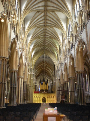


What inspires me about the style is the variation in the sculptures and strong details surrounding the doorway into the cathedral. The entrance to the building, underneath three large archways, reminds me of the triumphal arches of the Roman era. Its interesting to think whether the Normans were trying to mimic the Roman style in order to create the same overwhelming impact as their predecessors.


Sunday 26 June 2011
Finished Piece
My finished work for the art foundation course; shown in the two light stages my design was based around:


Friday 10 June 2011
Lincoln Open Day
I recently took a trip to Lincoln in order to check out the city's university. I was amazed by the old end of the small city and in particular the medieval cathedral which dominates the cityscape. It is built on top of a steep hill and was at one point the tallest building in the world until the spire collapsed in the Tudor times.


Friday 3 June 2011
Painting, Days 1-2
The cornerstone to my painting... I've started by painting a basic layer of oil which will make it easier to work over in the future when I'm adding more accurate colour and line. When the paint is dried (to an extent) I will sand the brushstrokes off to give it a smoother appearance.


Construction, Cutting out.
After about 2 weeks, the front of my light box is cut out and mounted. I blacked out most of the lighting in the room and tried the box out. As a silhouette of a building I think it has succeeded in its job... I can only hope the painting goes as well.


Wednesday 4 May 2011
Hillfields House, Coventry
Since my Coventry trip, I have been set on using this building as my final image. From this angle it has everything I need; lots of windows to make use of the light box, lots of colour (as opposed to the dull tones of other concrete buildings), and the opportunity to work in raised relief.
The building is called Hillfield House, in the Hillfields area of Coventry. The area is often given a bad press for its crime rate and standard of living, but regardless, I like the building. If I had to live in though, I'm sure I wouldn't have the same appreciation.

Tuesday 5 April 2011
Light Box Experiments
I was curious to see the light box idea in action so I set up a sample of a light box. By cutting out windows into mount board it acted as a gobo for the light. Behind the surface, I attached lighting gels and fabrics to represent glass and curtains used in an actual building. After blacking out the lights in the room I was able to see the full effect of the light box and this convinced me the idea would work.


Wednesday 23 March 2011
Urban Inspiration- Trip to Coventry
I already have a plan for the technique I am going to use in my final piece but I am lacking a good image to work from. It needs to be of a building that has lots of windows for the light box idea to be fully exploited. It also needs to be a domineering and powerful image to grasp the viewers attention. I decided that I was not going to find anything matching this description in Nuneaton, so i took a trip to nearby Coventry.
Going by the guidance of a friend who works in the city, I visited several apartment blocks. By having them as the subject, it would in-keep with my previous paintings and maximize the use of light through the many windows these buildings have.


Thursday 17 March 2011


Tuesday 8 March 2011
Queens Road Flats
Inspired by the 1920's block of flats along Queens Road in Nuneaton, I wanted to start drawings from it due to the interesting composition and the changes in light and shadow across the building. This started as a drawing on A1 and using oil paints I built up layers of colour and dry-brushed tone over the top. This was edited on iPhoto to give it the blurred edge.

Monday 7 March 2011
David Hepher
David Hepher is a painter that works on a large scale often onto concrete. As my work up to now has been focused on English apartment blocks these paintings immediately stood out. Because he works on such a large scale, it is easier to add greater detail into his work. The finished results are very photo-realist paintings. What particularly interests me is the personal touch he adds to each window or room; with different curtains or with washing strung outside. Contrary to this personalization is a slight eerie feeling, due to the lack of any actual people in the painting. For buildings that obviously house great numbers people and even show evidence of it, having a lack of inhabitants gives his work a slight '28 days later' feel.


Edward Hopper
Hopper was an artist who painted a scene of 1940's and 50's urban America. His style reminds me of Georgia O'Keeffe in the way he uses oil paints and the way he represents light. What interests me in his work is the idea of buildings acting as a sort of stage to which people can peer into. His paintings show a clear definition between the outside and the inside. The second painting down of the cafe is a good example of this as it represents the inside of the cafe as a warm, cosy bubble, whilst the outside appears as cold and dark. This gives the painting much character and drama.


Subscribe to:
Posts (Atom)