Friday, 24 December 2010

Hans Holbein. Crafty chap...

I know this has little to do with architecture but I don't really care. I was looking at portrait painters, after the life drawing class and found Hans Holbein. I love his paintings for the great attention to detail and realism. What is more impressive is that it was done in the Tudor era and was far ahead of its time in terms of quality. In my opinion some contemporary artists should hang there heads in shame when there work is compared to this.


The painting below is The Ambassadors. Its one of Holbein's most famous works. I like it for the hidden skull at the bottom of the picture. At first glance it appears to be a tear or a feather of a quill but when viewed at an angle it displays an image of a skull. Very crafty.

Friday, 17 December 2010

Stockholm Library

Stockholm Library, Sweeden
Asplund Architecture Competition, 2007
JDS Architects


In my research into how architects use light in their work, I found this model of a proposed library in Stockholm. In the model, bright, fluorescent lights have been used against a white canvas around it. This is effective in highlighting the building and making appear unique in its surroundings. Although I do admire the building itself for the way it blends into the landscape around it, it's the way the model markets the idea which interests me the most. 


Tuesday, 7 December 2010

Notre Dame Du Haut

After seeing this mentioned in the Guardian's architecture reviews, I decided to take a closer look at the chapel of Notre Dame Du Haut. I like how its architect, Le Corbusier, has used natural light and the way the building is built with thick walls, giving it a sense of structure. I also like how its shape is unconventional in how it uses sloping and curved walls rather than most churches which are designed in a box shape and are symmetrical.

Wednesday, 24 November 2010

3-D Work- Whiteread Style

Inpired by the work of Racheal Whiteread, I decided to start work on 3-D models based roughly around the design of the art block around me.

The first step was to build up a wall of cardboard over a set of blueprints I had drawn. These were set into clay and, as photographed, vasalined to prevent it sticking to the plaster.

I then poured plaster into the cast alowing it to flatten on the surface so I got a flat surface.

When the plaster became solid, I removed the walls and took the clay base off. I then sanded at the surface of the plaster to get a smooth wall and got this finished result:

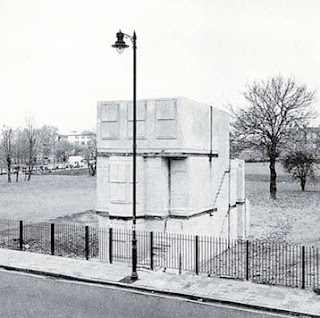
Racheal Whiteread

This artist inspired me because she uses plaster to take the mould of the inside of structures. This leaves the building looking as if it was turned inside-out and brings out the detail of doorways, windows and fireplaces. It also looks into negative space as the cast shows the hollow space as a solid adding emphisis to it.

Thursday, 28 October 2010

Wall Art

The paintings I did for my bedroom wall copied from Picasso's work. I like his style of work but its the first time I've really looked at it.


Light and Shadow- A2 work

Just to get off the mark, some photos from A2 where I started using 3D in my work. Seemed relevant to my current work as im now using clay/plaster again and looking into lighting.